
How to Wear Colours and Prints to Flatter Your Body Shape
Colour is one of the most powerful tools in personal styling. The right colour palette can enhance your complexion, but how you wear those colours on your body determines whether an outfit flatters your shape. In this guide, you’ll learn styling rules for light versus dark colours, how print size affects proportions, and how to use colour theory to build cohesive outfits. These principles apply to all seasonal palettes - Spring, Summer, Autumn and Winter.
How Light and Dark Colours Change Body Proportions
Light and dark values influence where the eye lands.
Light colours draw attention and can visually widen an area.
Dark colours recede and can visually slim or minimise an area.
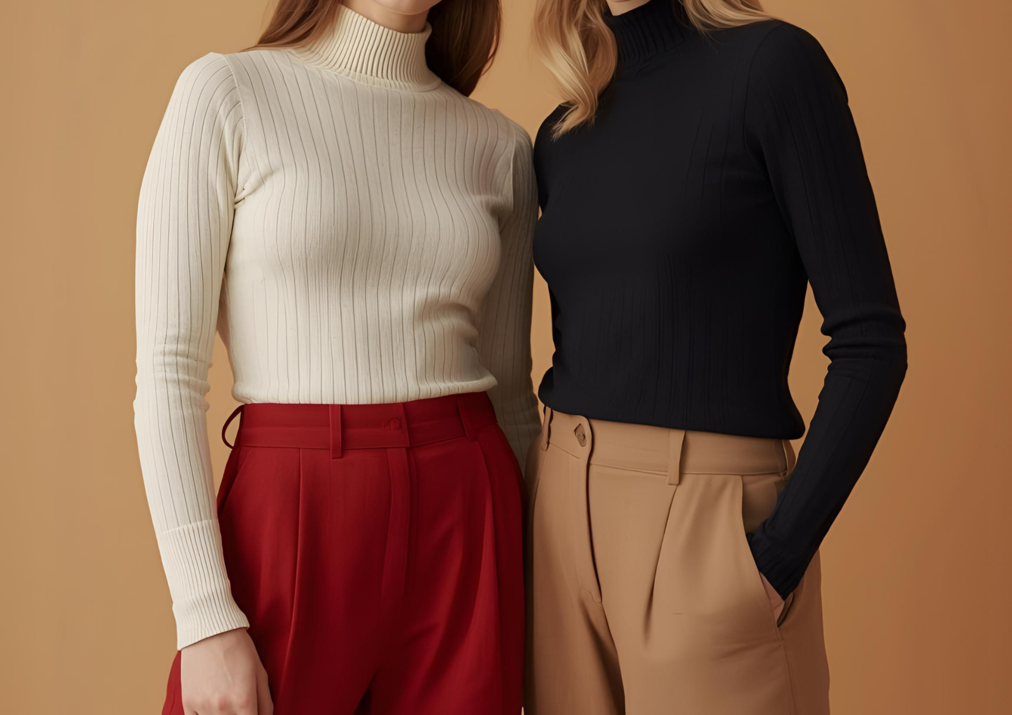
How to use this when dressing:
Lighter on top, darker on bottom → draws focus upward.
Darker on top, lighter on bottom → shifts focus downward.
Head-to-toe in one value (monochrome) → creates a longer, leaner visual line.
Using contrast deliberately is one of the fastest ways to visually balance proportions.
How Print Size and Direction Affect Your Silhouette

Prints do more than add personality, they reshape perception.
Print scale
Large prints add volume and attract attention.
Small prints soften and visually reduce.

Print direction

Vertical direction elongates and narrows.
Horizontal direction can add width.

Important rule for colour harmony
With prints, the background (base) colour should match your seasonal colour palette to maintain a cohesive and flattering look.

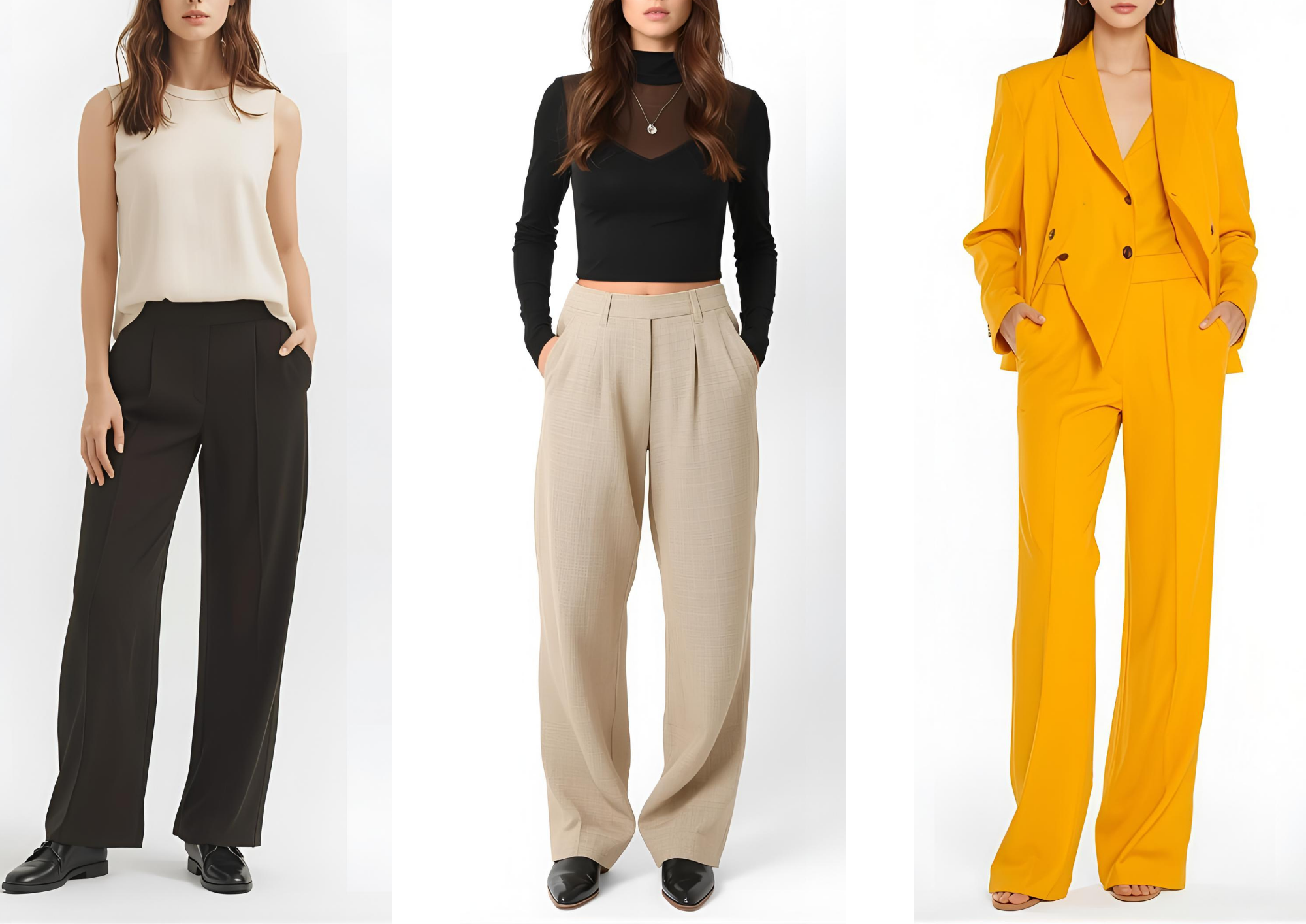
Colour Theory for Outfit Building (Monochrome, Complementary, Analogous)
Understanding the colour wheel helps you create intentional outfits within any palette.
Monochromatic combinations
Different tints/tones of the same colour → clean, elongating and minimalistic.
Complementary combinations
Colours opposite on the wheel → bold, high-contrast and dynamic.
Analogous combinations
Colours next to each other on the wheel → soft, harmonious and easy to wear.
Tertiary combinations
Mixes between primary and secondary colours → creative and modern.
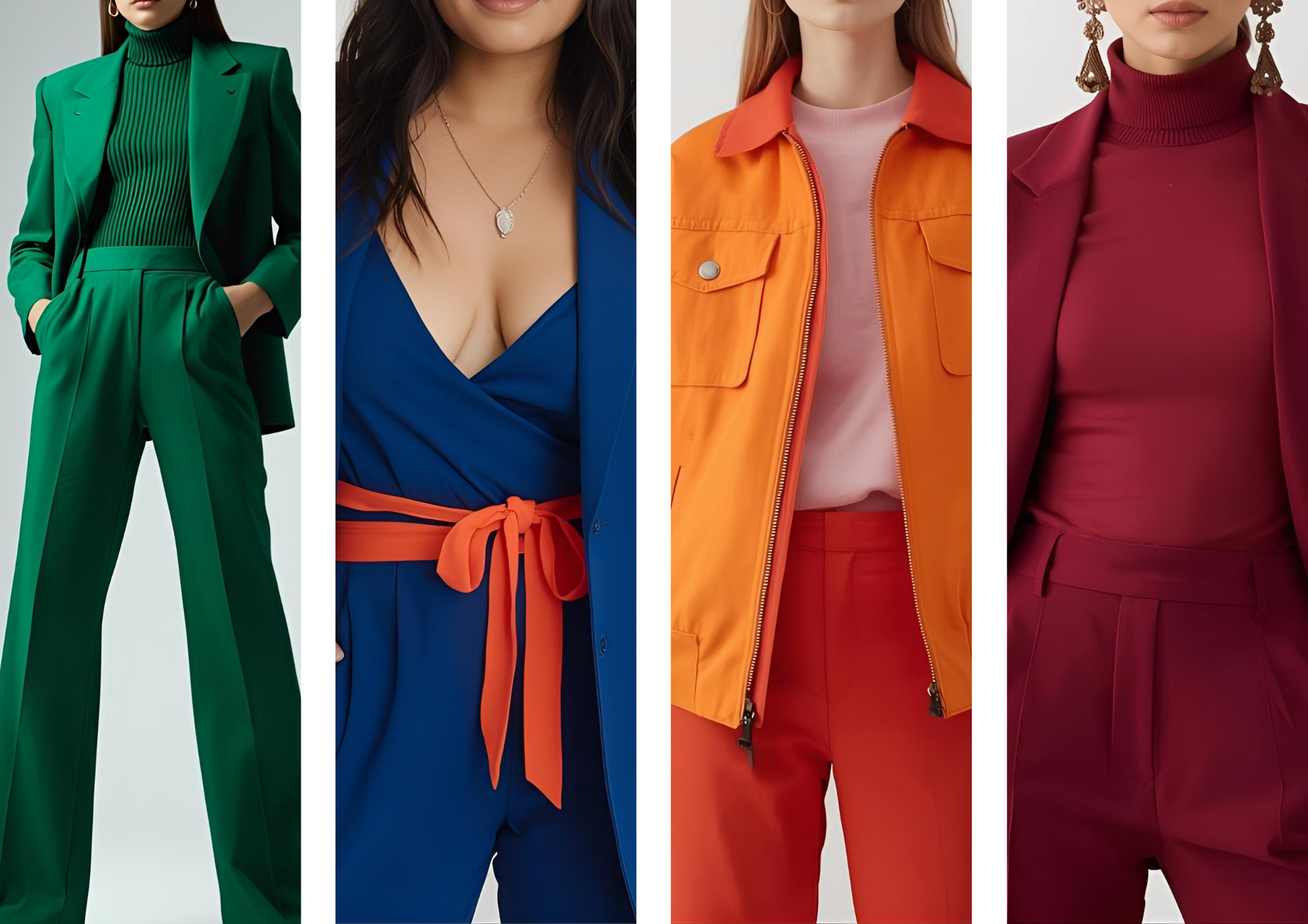
From left to right: monochromatic, complimentary, analogous and tertiary (red violet; between red and purple)
Universal Rules for Combining Colours in Outfits
Keep outfits to 2–3 main colours for a polished result.
Use neutrals as anchors and let one feature colour lead.
Match colour intensity (soft with soft, deep with deep) for balance.
Choose one visual focal point - avoid competing accents. With one exception = colour sandwiching by wearing the accent colour on the feet and on the upper body.

The jeans, beige top and brown loafers are the neutral. The brown and beige are from the same colour family. The red element is the accent/feature colour. So there are 3 colours combined of which the neutrals are the main.
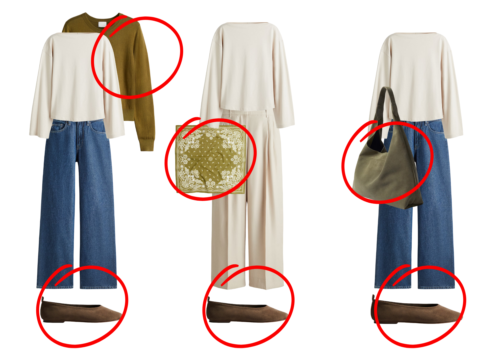
Colour sandwich of the shoe colour and focal piece colour not directly next to each other.
Why These Rules Matter Across All Colour Seasons
Seasonal colour analysis helps you select colours that flatter your skin tone.
Styling rules for light/dark placement, print scale and colour combinations ensure those shades also flatter your body proportions. When you combine both, you get outfits that look harmonious, intentional and visually balanced.
Ready to go deeper?
Use these principles inside each seasonal palette guide on colourbella to build outfits that highlight both your colouring and your shape.